Quick Answer
The 10 most common artist portfolio mistakes: wrong file format or size (over 20MB, wrong page dimensions), no artist statement or a generic one, poor artwork sequencing (opening with a weak piece), inconsistent image quality, missing or incomplete CV, no captions on artworks, and submitting a general portfolio instead of tailoring it to the specific call. Any one of these can get a portfolio rejected before the work is seen.
Fix them systematically before every submission. Use the free MyArtPDF checklist to review your document before sending.
Introduction
Every year, thousands of artists submit portfolio PDFs to:
- galleries
- residencies
- grants
- MFA programs
- open calls
And every year, selection committees repeat the same frustrations.
Not about the art.
About the portfolio document itself.
Most mistakes are simple formatting issues that make portfolios harder to read.
The good news: they are easy to fix.
If you want the full portfolio structure first, see the artist portfolio PDF guide.
Mistake 1 — Using design tools as portfolio tools
Many artists build portfolios with:
- Canva
- Google Docs
- InDesign
These tools are powerful but often introduce problems:
- inconsistent spacing
- layout shifts
- unpredictable PDF exports
- large file sizes
Reviewers usually prefer neutral documents, not designed brochures.
Mistake 2 — Artwork on the cover page
One of the most common mistakes is placing artwork on the cover.
Many institutions discourage this because image covers can be:
- distracting
- biased
- overly designed
A safer cover page usually includes only:
- your name
- the word Portfolio
- the year (optional)
Nothing else.
Mistake 3 — Overly long text sections
Artists often write:
- statements that read like essays
- biographies that read like memoirs
- CVs that list everything
Institutions usually prefer:
- Statement: 150–300 words
- Biography: 80–200 words
- CV: 1–2 pages
Concise text is easier to read during reviews.
Mistake 4 — Landscape portfolios
Horizontal portfolios cause practical issues.
They are:
- harder to print
- awkward on laptop screens
- inconsistent with institutional standards
Vertical pages are the safest option.
Mistake 5 — Too many artworks
More images do not make a stronger portfolio.
Typical expectations: 10–15 artworks
Too few images feel incomplete.
Too many images feel unedited.
Each artwork should usually appear on its own page.
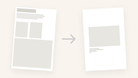
Mistake 6 — Poor image preparation
Two extremes are common:
Images too small → blurry prints
Images too large → heavy PDFs
A balanced approach:
- JPEG
- sRGB
- around 2000px long edge
Mistake 7 — Too many fonts
Some portfolios use:
- multiple fonts
- colored headings
- decorative elements
This quickly looks amateur.
Professional portfolios typically use:
- one typeface
- simple hierarchy
- black text
Mistake 8 — Incorrect page order
A confusing order disrupts reading.
Common mistakes:
- artworks first
- biography before statement
- no introduction
A typical professional order is:
- Cover
- Statement
- Biography
- CV
- Artworks
If the CV is the part you still need to build, start with the free Artist CV Generator. For the statement, use artist statement examples.
Mistake 9 — Technical PDF issues
Some portfolios break on institutional computers because of:
- custom fonts
- transparency effects
- CMYK images
- extremely large files
Simple PDFs are the most reliable.
Mistake 10 — Ignoring page formats
Two formats dominate:
- A4 (Europe)
- US Letter (North America)
Sending the wrong format can cause printing issues.
Many artists export both versions.
Final Thought
A portfolio is not a graphic design project.
It is a clear document that helps reviewers understand your work quickly.
Strong portfolios are simple.
Structure and clarity matter more than design tricks.
Try MyArtPDF
If you'd like to build portfolios with a clean, mistake-free structure:
Build your artist portfolio PDF
Author
I’m Alexandre Desane — visual artist & indie developer.
I build quiet tools for artists.