Quick Answer
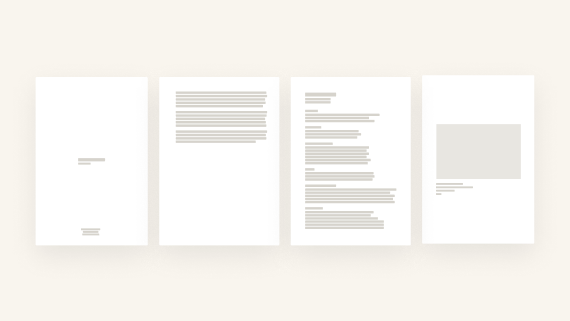
Standard artist portfolio PDF format: A4 or US Letter, vertical orientation, 10–15 artworks (one per page), JPEG images at ~2000px on the long edge. Page order: Cover → Artist Statement (150–300 words) → Biography (80–200 words) → CV (1–2 pages) → Artworks with captions. Keep the file under 20MB. Avoid decorative covers, drop shadows, and grids — institutions expect clean, neutral layouts.
Recommended PDF size: A4 for European applications, US Letter for North American ones. Export both when applying internationally.
Ready to build it? Create your portfolio PDF with MyArtPDF.
What is an artist portfolio PDF? A structured document — typically 15–25 pages — used to submit your work to galleries, residencies, grants, and art schools. Unlike a website or printed book, it is designed to be sent by email, uploaded to application portals, and reviewed on screen or printed by a jury. Format, order, and file size matter as much as the work inside.
A professional artist portfolio PDF should follow a simple institutional structure:
- Cover page
- Artist statement
- Artist biography
- CV
- Selected artworks
Text should be concise, images clear, and layout neutral.
If you want the quick reference version of these rules, see the main artist portfolio PDF guide.
Why This Guide Exists
Every artist eventually needs a professional PDF portfolio.
You need one for:
- residencies
- grants
- galleries
- MFA applications
- open calls
- studio visits
But almost nobody teaches how these documents should actually be structured.
Most artists improvise with:
- Canva
- Google Docs
- InDesign
These tools can work, but they are not designed for institutional portfolios.
After researching dozens of calls, museum guidelines, and residency instructions, a consistent structure appears.
This article explains that structure.
The Only Portfolio Structure That Works Everywhere
Across institutions, juries and selection committees, the same structure appears repeatedly.
A professional portfolio PDF should follow this order:
- Cover Page
- Artist Statement
- Artist Biography
- CV
- Portfolio (artworks)
This order follows a simple logic:
Introduce → contextualize → frame the practice → show the work
Reviewers expect this reading flow.
When the order changes, the document becomes harder to evaluate.
The Cover Page (Keep It Institutional)
One surprising result from institutional guidelines:
Most institutions discourage artwork on the cover page.
Image covers are often seen as:
- distracting
- overly designed
- biased
- non-standard
A correct cover page usually contains only:
- Your full name
- The word “Portfolio”
- The year (optional)
Example:
Your Name Portfolio 2026
Nothing more.
The Artist Statement
Many artists overcomplicate statements.
Institutions usually prefer:
- 150–300 words
- clear language
- one short paragraph
- direct explanation of the work
Panels often read hundreds of applications.
Clarity matters more than literary style.
A strong statement should answer:
- What do you explore?
- How do you work?
- Why does this matter?
The Artist Biography
The biography is not a CV.
It is a short professional introduction.
Typical expectations:
- 80–200 words
- place of birth
- base city
- themes of the work
- key exhibitions or recognitions
Its goal is simply to situate the artist.
The CV
An artist CV should be short and structured.
Most institutions expect 1–2 pages maximum.
Typical sections include:
- exhibitions (solo and group)
- education
- residencies
- awards
- collections
- publications
Long CVs become difficult to scan.
Selection is part of professionalism.
If you need to generate the CV itself instead of formatting it manually, use the free Artist CV Generator.
If you are still refining the sequence, read the portfolio page order guide.
If you need the statement that sits before the work, browse artist statement examples.
The Artwork Section
This is the most important part of the portfolio.
Typical expectations:
- 10–15 artworks
- one artwork per page
- centered images
- generous margins
- consistent captions
Each artwork caption should include:
- title
- year
- medium
- dimensions
Good caption: Untitled (Green Figure No. 3), 2025. Oil stick and oil pastel on paper. 70 × 50 cm.
Too vague: Painting, 2025. Mixed media. — Missing dimensions, medium unclear. A reviewer cannot catalogue this work.
Over-written: Green Figure No. 3, 2025. Oil stick and oil pastel on paper. 70 × 50 cm. Part of an ongoing series exploring the construction of identity through color distortion and surface tension. — The note is doing the statement's job. One sentence maximum if you add context at all.
Avoid:
- frames
- drop shadows
- collage layouts
- grids
Just the work.
Image Quality
A portfolio PDF should balance clarity and file size.
Recommended image specifications:
- JPEG
- sRGB
- around 2000px on the long edge
- under ~5MB per image
Very large files slow down reviewers.
Very small images lose detail.
Vertical vs Landscape Portfolios
Many artists ask whether landscape PDFs are acceptable.
In practice, vertical portfolios are the standard.
Reasons:
- Most institutions print PDFs
- Printers are optimized for vertical documents
- Vertical pages are easier to read on laptops
Landscape portfolios are rarely requested.
A4 vs US Letter
Two page formats dominate:
- A4 (Europe)
- US Letter (North America)
When applying internationally, it is often useful to export two versions.
This avoids printing or margin issues.
Format by Application Type
The standard structure above applies everywhere — but emphasis shifts depending on where you are applying.
For residencies Lead with a strong artist statement or project proposal. Selection committees are evaluating your practice direction and whether it fits their programme. The artworks confirm the statement, they don't replace it. If the call asks for a project proposal, it goes before or in place of the general statement.
For galleries Open with your strongest work. Gallerists move quickly — the first two or three pages decide whether they keep reading. Keep text short. The CV matters less than the visual coherence of the body of work.
For MFA applications The CV and statement carry more weight here than in other contexts. Academic committees want to understand your trajectory and your capacity to articulate your practice. Give the statement more space (up to 400 words is acceptable) and include relevant education, awards, and exhibitions even if early-career.
For open calls and grants Read the submission guidelines before anything else. Many open calls specify exact page counts, file sizes, and section order. Non-compliant submissions are often disqualified automatically, regardless of the work.
Why I Built MyArtPDF
Like many artists, I struggled with portfolio tools.
Most options were either:
- overly complex
- visually limited
- not designed for artists
So I built a simple tool focused only on portfolio structure.
MyArtPDF generates:
- clean layouts
- institutional formatting
- consistent PDFs
All offline, with no login and no tracking.
You can read more about this philosophy in the MyArtPDF manifesto.
Try MyArtPDF
If you'd like to build a properly formatted artist portfolio PDF:
Build your artist portfolio PDF
No subscription. No design skills required.
Author
I’m Alexandre Desane — visual artist & indie developer.
I build quiet tools for artists.