Artist Guides
Artist Portfolio PDF: format, order, and examples.
A practical guide to the structure institutions expect: page order, text length, image specs, file size, and export standards for a clean, gallery-ready PDF.
Whether you call it an artist portfolio PDF or an art portfolio PDF, the goal is the same: presenting your work clearly for galleries, residencies and applications.
This page is written for artists who need a PDF that can actually be sent, reviewed, printed, and archived without layout surprises. It focuses on the standard document format used across galleries, residencies, grants, and MFA applications.
Quick answer: a standard artist portfolio PDF usually includes a cover page, artist statement, short biography, CV, and 10–15 selected artworks.
If you want the product pages behind this workflow: See MyArtPDF pricing Go to download Browse portfolio templates
- Typical length: 10–20 pages
- Selected works: 10–15 artworks
- Format: A4 or US Letter
- File type: PDF
In this guide
Who this page is for
This guide is for artists preparing a PDF portfolio for:
- galleries
- residencies
- grants
- MFA applications
- open calls
- studio visits
It focuses on the format that works in the widest range of institutional contexts.
If you need ready-to-use building blocks rather than theory first, start with the Artist portfolio PDF template and examples or the portfolio PDF example.
The standard structure that works almost everywhere
A professional artist portfolio PDF is closer to a small catalogue than a designed brochure. Reviewers want a predictable order, a document they can skim quickly, and a format that prints cleanly.
In most cases, a strong artist portfolio PDF is about 10 to 20 pages, depending on the application and the number of artworks requested.
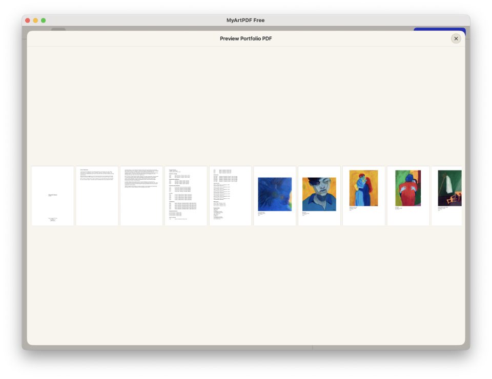
The most widely accepted structure is:
- Cover page (name + “Portfolio” + year)
- Artist statement
- Short biography
- CV (1–2 pages)
- Selected works (10–15 artworks)
This follows a simple reading logic: introduce → contextualize → frame → show the work.
If you want the sequencing version of this logic, read the portfolio page order guide.
If you want the longer editorial breakdown of this logic, read the ultimate artist portfolio format (2026).
Cover page: keep it neutral
A strong cover page is usually a quiet one.
In most institutional settings, the safest cover includes only:
- Your name
- The word Portfolio
- The year (optional)
Avoid logos, decorative layouts, or artwork on the cover unless the application explicitly asks for it.
Text sections: what reviewers actually read
Institutions skim. Clarity matters more than literary performance.
Safe ranges for most artist portfolio PDFs:
- Artist statement: 150–300 words
- Biography: 80–200 words
- CV: 1–2 pages max
The point is not to say everything. The point is to make the work legible quickly.
If you want ready-to-edit models: Read artist statement examples Read artist biography example Read artist CV template
CV: structure over completeness
A portfolio CV is not an academic CV and not a life archive.
Keep it minimal and scannable:
- Selected exhibitions (solo / group)
- Education
- Residencies
- Awards / grants
- Publications (optional)
- Collections (optional)
If your CV grows beyond two pages, curation becomes part of professionalism.
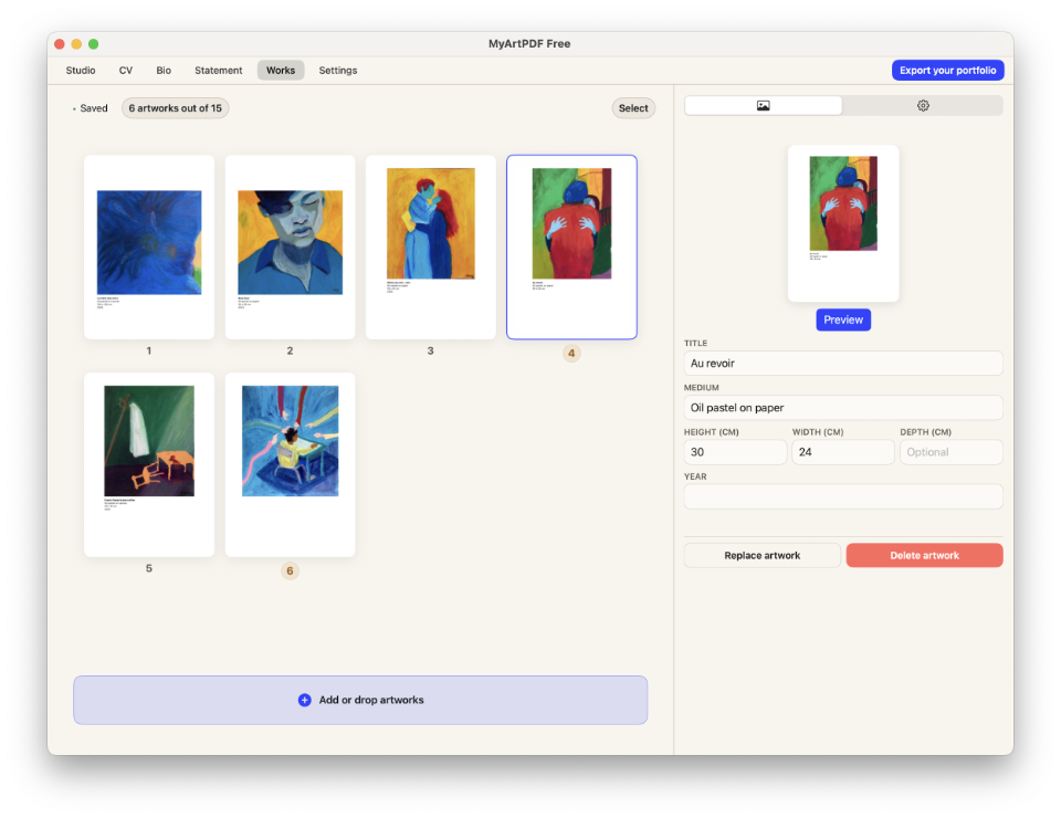
Selected works: 10–15 is usually the sweet spot
Too few works feels incomplete. Too many feels unedited. For most applications, 10–15 artworks is a strong range.
Standard presentation:
- One artwork per page
- White background, generous margins
- Consistent metadata caption
Caption fields usually include: Title, year, medium, dimensions, and edition or installation notes if relevant.
Sequencing matters
The order of artworks changes how the portfolio reads. Open with a strong image, build coherence in the middle, and end with a work that leaves direction rather than noise.
For a deeper sequencing method Read how artists should sequence their portfolio.
Adapting your portfolio for different contexts
The core structure stays the same across most applications. What changes is how you weight each section and which works you select.
For galleries: Lead with your strongest recent work. The statement should describe your practice in general terms — galleries are evaluating whether your work fits their programme over time, not a single project. The CV matters here more than anywhere else.
For residencies: The statement becomes more specific. Most residency applications want to understand what you intend to develop during the residency, not just what you have already made. Select works that are in genuine dialogue with the residency's location, theme or format.
For open calls: Read the call as a brief. Your image selection and statement should answer one question: why does this work belong in this specific context? A portfolio built for one open call and sent unchanged to a dozen others is always readable as such.
For MFA applications: Schools want to see range and development. Unlike gallery or residency submissions, showing works across different periods or series is appropriate — it demonstrates trajectory, not just current practice.
Submission checklist — before you send
Two minutes before every submission.
Document structure
- Cover page includes your name and contact information
- Statement comes before the artworks, not after
- CV leads with exhibitions, not education
- Biography is in third person and under 200 words
Image selection
- Works selected are relevant to this specific call or venue
- Image count is within the call's specified limit
- First image is your strongest — it sets the tone for everything
- Each artwork has a complete caption: title, medium, dimensions, year
Technical
- PDF is under 15MB (or the submission's specified limit)
- Page format matches the region: A4 for Europe, US Letter for North America
- PDF opens correctly on a second device before sending
- File is named clearly: LastnameFirstname-VenueName-2026.pdf
Statement
- Opening sentence does not begin with "My work explores"
- Statement is specific to this call or venue, not a generic version
- Word count is within any specified limit
Image specs that work in real institutions
The goal is simple: crisp images without an unnecessarily heavy PDF.
- Format: JPEG
- Color: sRGB
- Size: around 2000px on the long edge
- No upscale: never enlarge small images
This balances quality, compatibility, and load speed on older institutional computers.
File size, A4 vs US Letter, and compatibility
Many calls impose size limits. A safe target is often a PDF under about 10–15MB, unless the call says otherwise.
- Page format: A4 for Europe, US Letter for North America
- Avoid: CMYK images, unusual fonts, complex transparencies
- Check: open the PDF on laptop and phone before sending
If you keep the document simple, it will display more reliably everywhere.
Common mistakes (and how to fix them)
Most portfolio problems are not artistic. They are structural: too much text, inconsistent captions, heavy files, awkward covers, unpredictable layouts, or weak ordering.
For the full checklist: Read the biggest mistakes artists make in PDF portfolios.
Before you send your PDF
- Check the requested page format
- Check any file size limit
- Open the PDF on another device
- Verify that captions are consistent
- Remove anything decorative that does not help the work
Build it with less friction
The easiest way to stay institution-ready is to reduce decisions: one structure, one typography system, one set of export rules.
That is the philosophy behind MyArtPDF: a local-first macOS app that helps visual artists build a clean PDF with CV, biography, artist statement, artworks, metadata, and export settings in one focused workflow.
No mandatory account. No cloud dependency. No unnecessary complexity.
Download MyArtPDF
If you want to build this kind of portfolio without wrestling with complex layout software, you can download MyArtPDF for macOS.
A focused macOS app for visual artists who need clean, gallery-ready PDFs.
Frequently asked questions
What should an artist portfolio PDF include?
In most cases: cover page, statement, biography, CV, and selected works — in that order.
How many pages should an artist portfolio PDF be?
Usually about 10 to 20 pages, depending on the application and the number of artworks requested.
How many artworks should I include?
Usually 10 to 15. Enough to feel edited, not overloaded. If a call specifies a maximum, stay at or below it.
Should an artist portfolio be a PDF?
Yes. PDF is the standard format for most submissions because it preserves layout across all devices and operating systems. Only deviate from this if the call explicitly asks for another format.
Should I use A4 or US Letter?
A4 for Europe, US Letter for North America. If you apply internationally, export both and use the appropriate one per institution.
Should I add artwork on the cover?
Usually no. A neutral cover with your name and contact is the safest institutional choice. An artwork on the cover only works if the image is strong enough to carry the page alone.
Should my CV be inside the PDF or sent as a separate file?
Inside the PDF unless the call explicitly asks for it separately. Most institutions prefer a single document — it is easier to store, review and share internally.
Can I send the same PDF to multiple galleries and residencies?
You can use the same base structure, but the statement and image selection should be adapted for each application. A generic PDF sent unchanged is immediately recognisable. At minimum, rewrite the opening of your statement for each context.
What if the call asks for JPEGs instead of a PDF?
Follow the instructions exactly. Some platforms (CaFÉ, Submittable) ask for individual image files. Export as JPEG, sRGB, 2000px on the long edge, and prepare your text documents separately.
How do I reduce file size without losing image quality?
Export images at 150 dpi for screen submissions — sufficient for review and significantly smaller. Avoid embedding full-resolution TIFFs. Use your tool's "optimise for screen" export option before sending.
What if my CV is very short because I am early in my career?
Submit it as it is. Many open calls and residencies are specifically aimed at emerging artists. A short, honest CV with real entries reads better than a padded one.