Why This Guide Exists
Every artist eventually needs a professional PDF portfolio — for residencies, grants, galleries, MFA applications, calls, or studio visits.
But nobody teaches how these documents should actually be formatted.
Most artists learn by copying outdated templates or improvising in Canva, Google Docs or InDesign. And almost nobody checks the expectations of galleries, institutions or juries.
In this article, I break down:
- the correct structure of a professional artist PDF portfolio
- the standards expected by institutions in 2026
- what to avoid
- and the logic behind MyArtPDF’s choices
This is the guide I wish I had ten years ago.
If you’re looking for a concise reference page, see the artist portfolio PDF guide → https://myartpdf.app/artist-portfolio-pdf
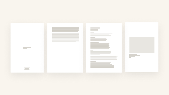
The Only Portfolio Structure That Works Everywhere
After analyzing dozens of residency guidelines, gallery submissions, grant requirements and museum instructions, a clear pattern appears.
A professional PDF portfolio should follow this structure:
- Cover Page (no artwork image)
- Artist Statement
- Artist Biography
- CV
- Portfolio (artworks)
Why this order?
Because this is the order used by:
- institutions
- juries
- MFA admissions
- gallery reviews
- fellowship committees
- open call panels
It follows the logic:
Introduce → contextualize → frame your practice → show your work.
This is the structure MyArtPDF exports by default.
The Cover Page (Keep It Institutional)
One of the biggest surprises from my research was simple:
👉 Approximately 80% of institutions do NOT want an artwork image on the cover page.
They consider image covers:
- distracting
- too “designed”
- misleading
- non-standard
- or simply not neutral enough for evaluation
A correct cover page should contain ONLY:
- Your full name
- The word “Portfolio”
- The year (optional)
Nothing else.
This is why MyArtPDF deliberately generates a minimal, image-free cover page.
It follows institutional standards and ensures your document is taken seriously.
Example of a proper cover (three separate lines, centered or left-aligned):
Your Name
Portfolio
2026
Nothing more.
The Statement (What Reviewers Actually Read)
Most artists overthink statements.
Institutions prefer:
- 150–300 words
- one paragraph
- clear language
- no metaphors
- no philosophical opacity
Panels read dozens (sometimes hundreds) of applications.
They appreciate clarity more than poetry.
The statement should explain:
- what you explore
- how you work
- why your approach matters
- what the viewer should pay attention to
The Biography (Shorter Than You Think)
An artist biography is not a CV and not a narrative.
Institutions expect:
- 80–200 words
- place of birth
- base city
- key themes
- main exhibitions or recognitions
- optionally: educational background
The goal:
A short professional introduction.
The CV (1–2 Pages Maximum)
A portfolio CV is not an academic CV.
It should be:
- structured
- chronological
- minimalist
- maximum two pages
Institutions do not want long documents.
Sections commonly expected:
- Exhibitions (solo & group)
- Education
- Residencies
- Awards
- Collections
- Publications
If your CV exceeds 2 pages, it becomes harder to read and less effective.
Artworks: The Most Important Section
Institutions care most about the artwork section.
Expectations:
- 15 images maximum
- artworks full width, centered
- consistent margins
- clear caption:
- Title
- Medium
- Dimensions
- Year
No frames.
No shadows.
No decorative borders.
No collages.
No grids.
Just the work.
Image Quality (What Institutions Expect)
Ideal specifications:
- JPEG (not PNG)
- sRGB
- 2000px on the long edge
- under 5MB per file
Large RAW images slow down reviewers and cause PDF compatibility issues.
In MyArtPDF, images are resized and compressed safely so you don’t have to manage it manually.
Why MyArtPDF Only Exports Vertical Portfolios
A common question is:
“Why don’t you support horizontal (landscape) PDF layouts?”
Here’s why:
- Most institutions print PDFs.
- All printers are optimized for vertical documents.
- Vertical PDFs are easier to read — on screen and on paper.
- Vertical is the universal institutional format.
Landscape layouts:
- are rarely expected
- often look non-professional
- break consistency
- complicate printing
So I made a clear design decision:
👉 MyArtPDF exports only vertical PDFs (A4 or US Letter).
No landscape option.
No ambiguity.
Just institutional compliance.
A4 vs US Letter (and Why It Matters)
Europe expects A4.
North America expects US Letter.
To keep your portfolio usable everywhere:
👉 Export two versions: A4 and US Letter.
MyArtPDF lets you choose format at export — no resizing required.
Why MyArtPDF Exists (A Personal Note)
Like many artists, I’ve struggled with:
- Canva (too slow, too many features)
- InDesign (an entire profession)
- Google Docs (visually limited)
- miscellaneous PDFs stitched awkwardly
None of these tools respected the way artists actually work.
So I built the tool I needed:
- offline
- no login
- automatic layout
- clean institutional design
- everything stays on the device
- simple
- quiet
- focused
A tool that doesn’t fight you.
If you want the principles behind these decisions (local-first, no accounts, quiet tooling), read the MyArtPDF manifesto: https://myartpdf.app/manifesto
Pre-Launch — Get Notified
If you want early access to MyArtPDF when it launches:
Get early access →: https://myartpdf.app/#early-access
No spam.
Just one message at launch.
Author
I’m Alexandre Desane — visual artist & indie developer.
I build quiet tools for artists.