Introduction
Every year, thousands of artists submit their PDF portfolios for residencies, grants, galleries, MFA applications, and open calls. And every year, juries repeat the same frustrations.
Not about the art —
but about the portfolio format itself.
After reviewing institutional guidelines and talking with artists who struggle with submissions, I’ve identified the mistakes that consistently hurt applications.
Almost all of them are easy to fix.
Mistake #1 — Treating Canva, Google Docs or InDesign as “portfolio tools”
Canva looks friendly.
Google Docs feels simple.
InDesign feels professional.
But for portfolios, they often create:
- broken spacing
- layout shifts between devices
- inconsistent exported PDFs
- unpredictable font rendering
- heavy file sizes
Reviewers don’t want a designed brochure.
They want a clean, neutral document.
Mistake #2 — Artwork on the cover page
As I learned while researching MyArtPDF:
👉 Most institutions discourage or reject artwork on the cover page.
Image-based covers are seen as:
- biased
- distracting
- non-standard
- overly branded
A correct cover page should include only:
- Your name
- The word Portfolio
- The year (optional)
No image.
No logo.
No design.
Mistake #3 — Overlong text sections
Common patterns:
- statements that read like essays
- biographies that read like memoirs
- CVs that list absolutely everything
Institutions prefer:
- Statement: 150–300 words
- Biography: 80–200 words
- CV: 1–2 pages, maximum
Longer texts are rarely read fully.
Mistake #4 — Horizontal (landscape) portfolios
Horizontal PDFs cause real issues:
- awkward to print
- difficult to review on laptop screens
- inconsistent with institutional standards
Vertical is the norm.
This is why MyArtPDF only exports vertical A4 or US Letter pages — never landscape.
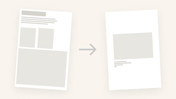
Mistake #5 — Too many or too few artworks
Portfolios with 3 images feel incomplete.
Portfolios with 40 feel unedited.
The sweet spot for applications:
👉 10 to 15 artworks, one per page.
Each artwork should be:
- full width
- centered
- accompanied by a clear caption
No grids, no collage layouts, no double images per page.
Mistake #6 — Poor image quality
Two extremes destroy clarity:
- images too small → blurry at print
- images too large → PDF too heavy to open
The institutional ideal:
- JPEG, not PNG
- sRGB
- around 2000px on the long edge
- under 5MB per image
Mistake #7 — Multiple fonts and styles
Portfolios with:
- 3 or 4 different fonts
- varied sizes
- colored headings
- decorative rules
… immediately look amateur.
Professional portfolios use:
- one typeface
- one hierarchy
- black text only
MyArtPDF uses Helvetica (or Arial fallback) to stay neutral.
Mistake #8 — Pages out of order
An incorrect order:
- biography before statement
- artworks before CV
- no introduction at all
… disrupts the reading flow.
A professional order:
- Cover
- Statement
- Biography
- CV
- Artworks
This structure is the most widely accepted.
Mistake #9 — PDF compatibility problems
Issues like:
- custom fonts
- transparencies
- giant images
- CMYK color profiles
… often cause display problems on institutional computers.
MyArtPDF outputs safe, consistent PDFs using sRGB, embedded fonts and flattened layouts.
Mistake #10 — Ignoring A4 / US Letter
Europe uses A4.
North America uses US Letter.
Sending the wrong format:
- cuts margins when printed
- introduces scaling
- can cause technical rejection
MyArtPDF allows you to export in A4 or US Letter, depending on where you apply.
Conclusion — Simplicity Is a Strength
In the end, a strong portfolio is not about design tricks or software complexity.
It’s about:
- clarity
- structure
- respect for institutional norms
- and focus on the work itself
That’s why I built MyArtPDF:
to remove the friction and let artists focus on what matters.
Pre-Launch — Get Notified
If you want early access to MyArtPDF when it launches:
Get early access →: https://myartpdf.app/#early-access
Author
I’m Alexandre Desane — visual artist & indie developer.
I build quiet tools for artists.